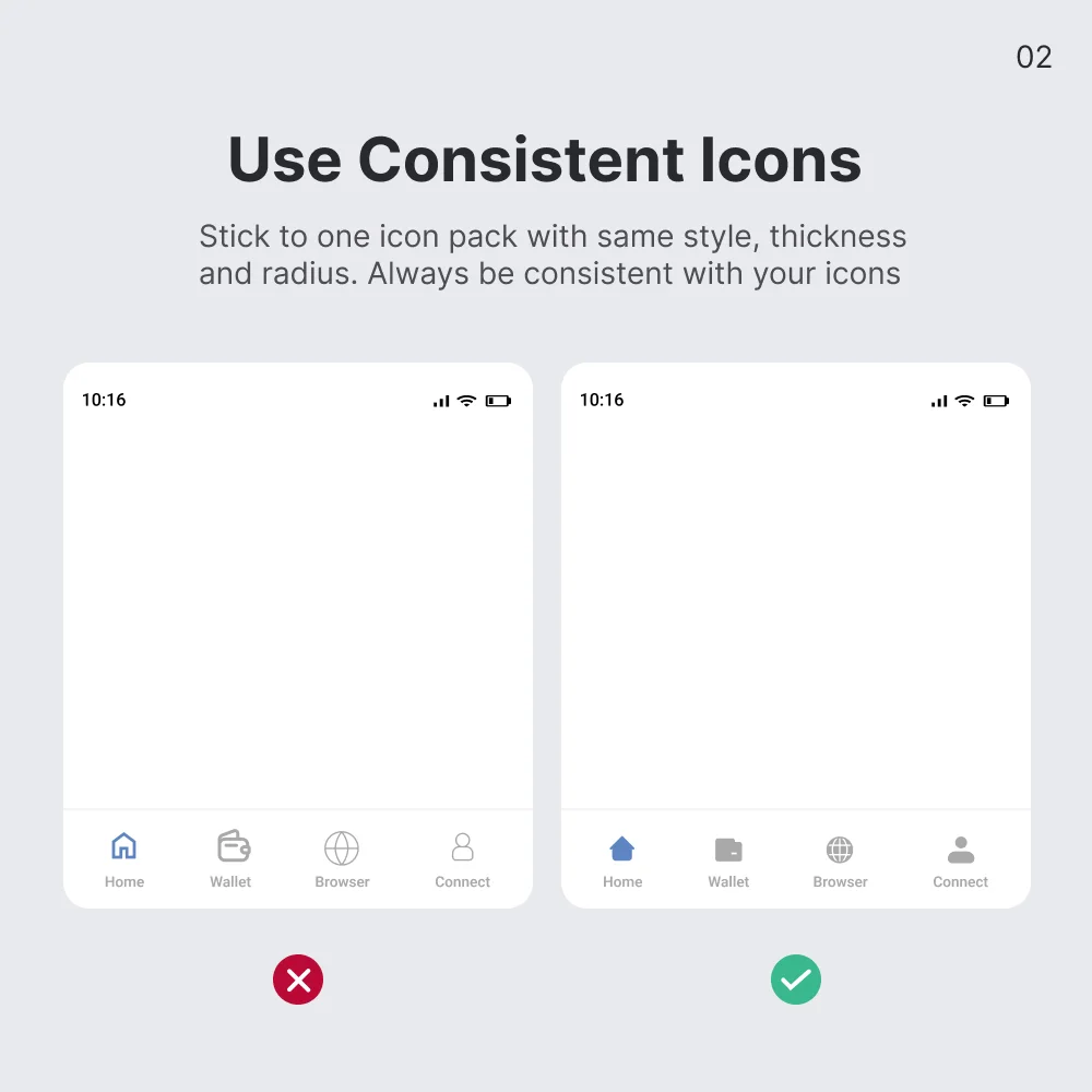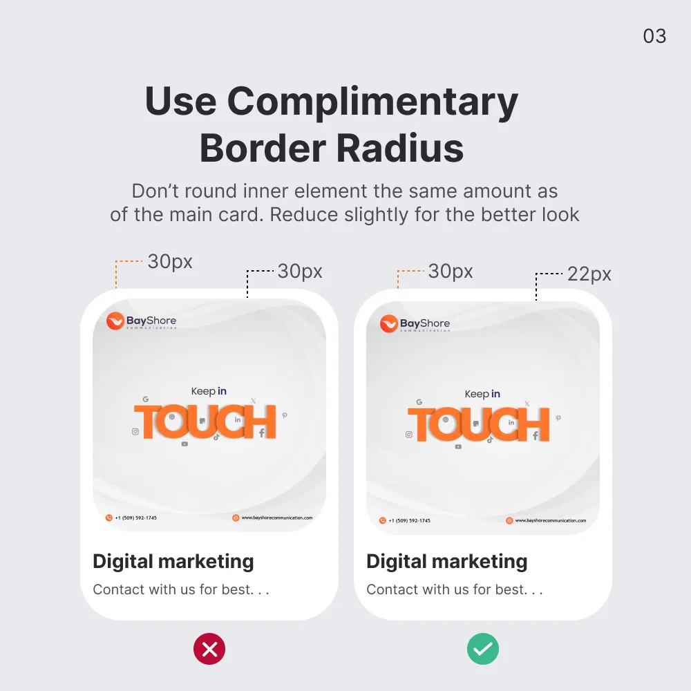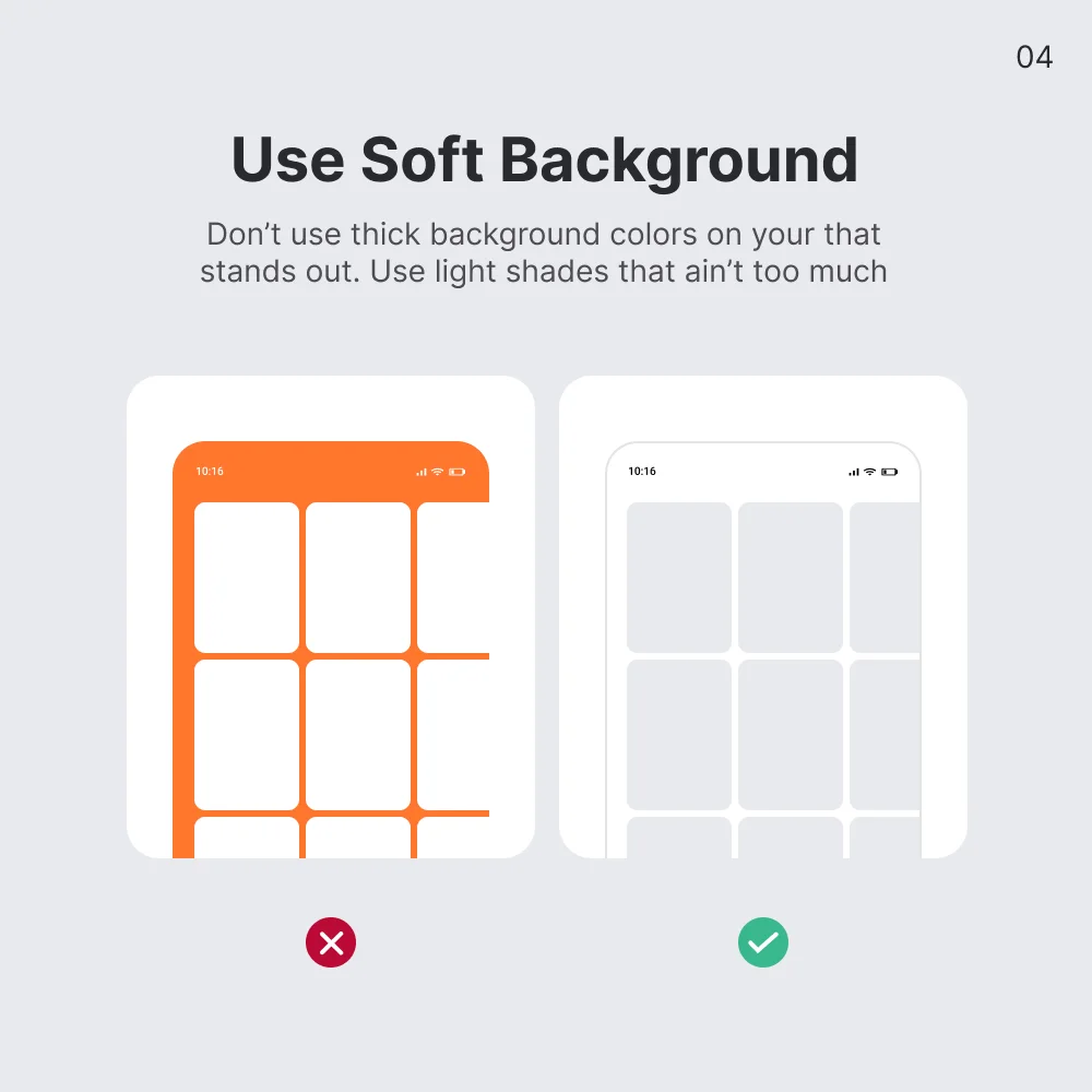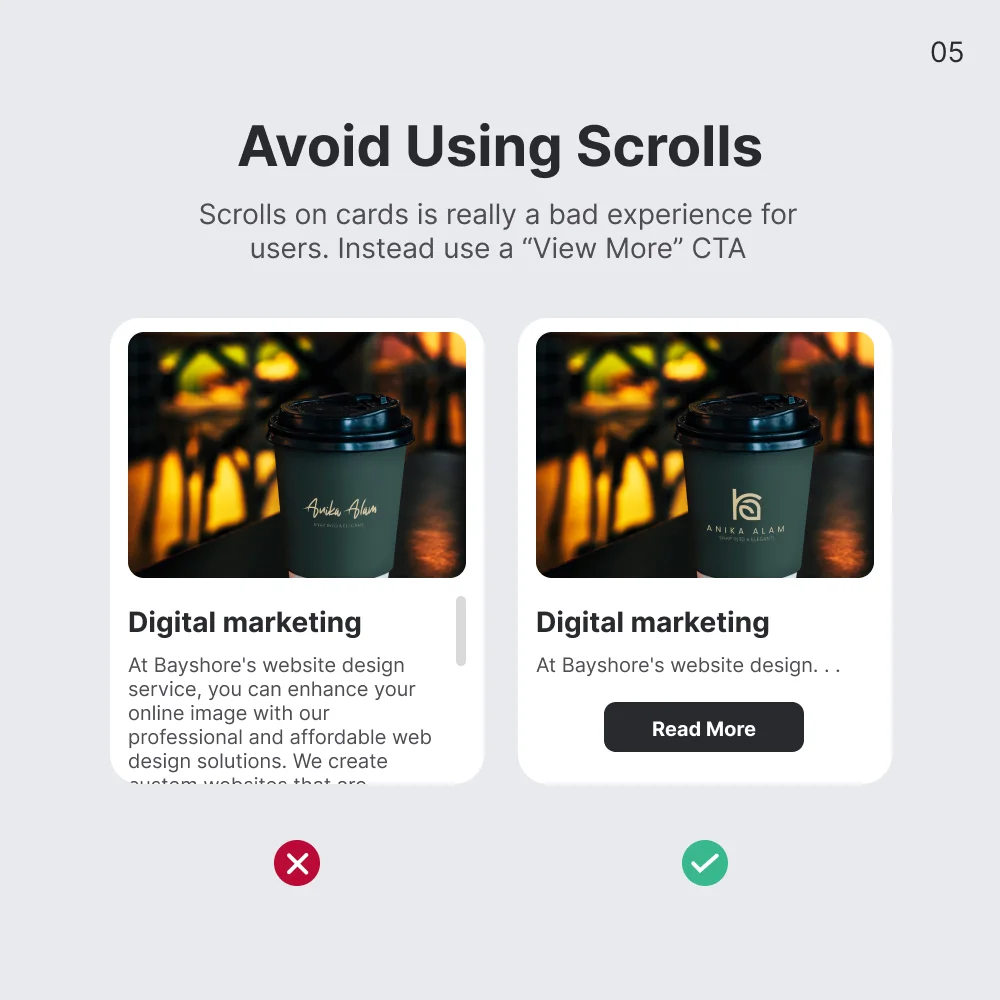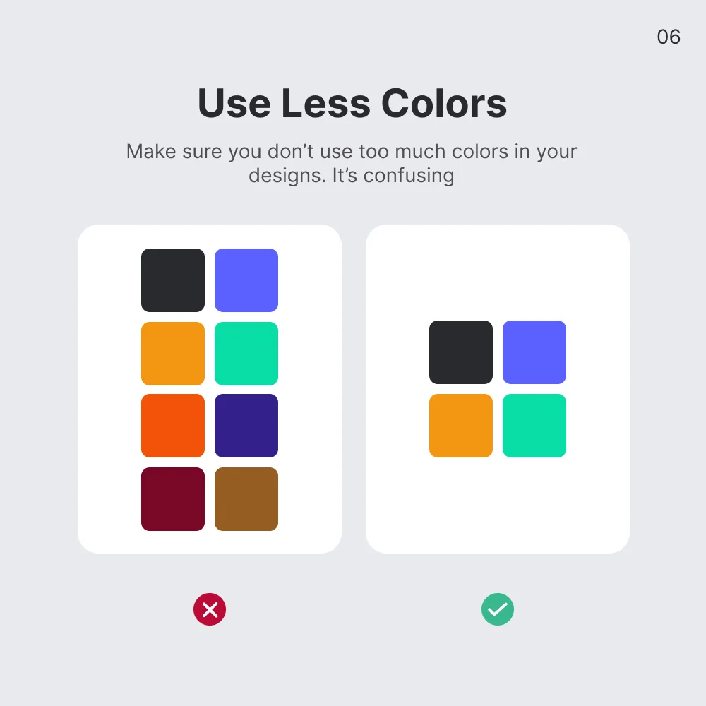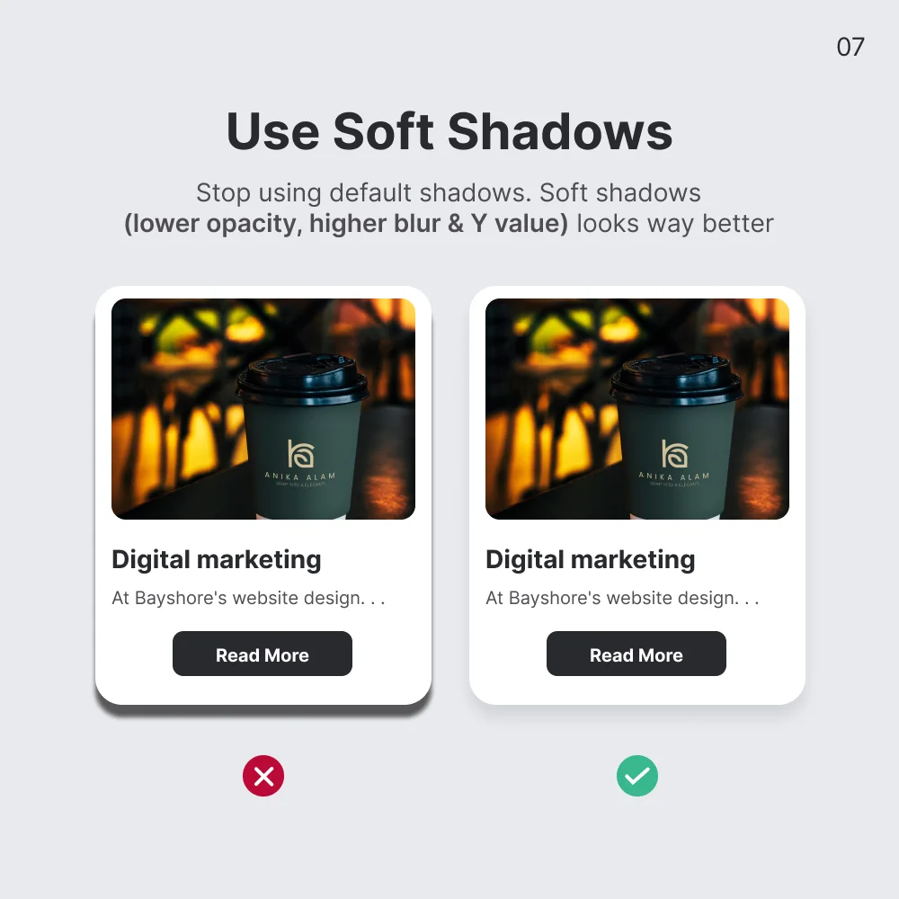
As a UI designer dedicated to crafting visually appealing and user-friendly interfaces, I've distilled my experience into a guide to elevate your designs. Begin by ensuring consistency with icons by using a style guide and an icon library, and test across devices. For border radius, experiment with values to maintain a cohesive look, using larger radii for buttons and smaller ones for input fields. Choose soft backgrounds that complement your brand and avoid distracting elements; subtle gradients or textures can enhance the overall feel. Minimize scrolling by designing layouts that fit the viewport and employing techniques like pagination or lazy loading. Limit your color palette to avoid overwhelming users and maintain a clean design. Lastly, apply soft shadows to add depth without creating visual clutter, enhancing both realism and readability.

